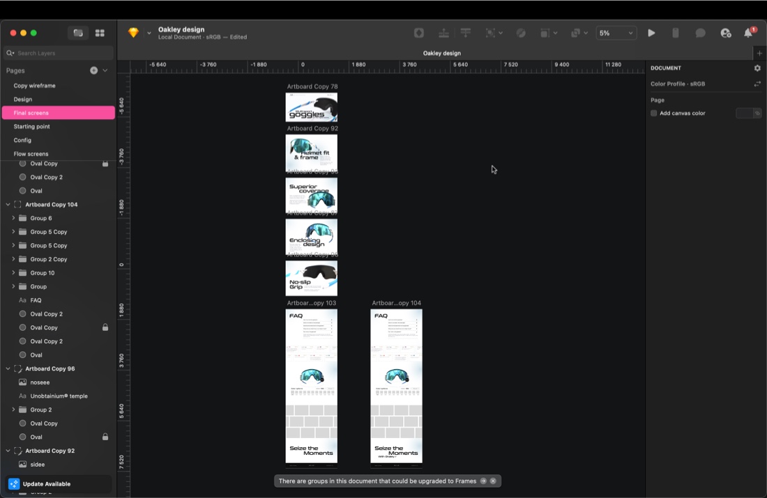
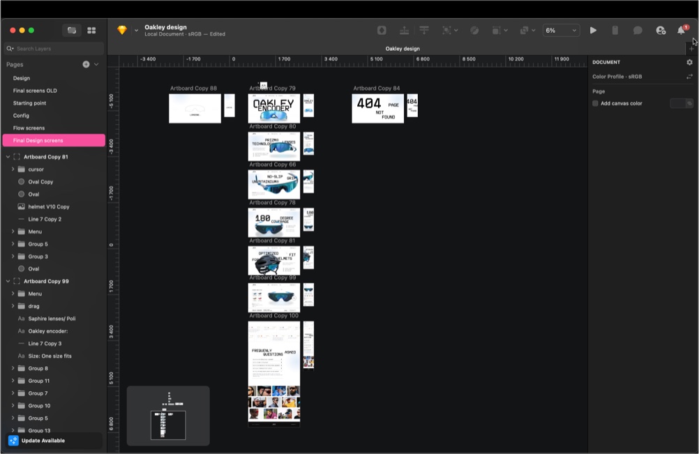
Building the assets
About the Project & Client
Oakley is an interactive design case study exploring how a global sports brand could use a 3D interactive website concept to immerse users in bold visuals and dynamic storytelling. This project demonstrates our ability to craft scroll-based immersive websites for portfolio showcases.
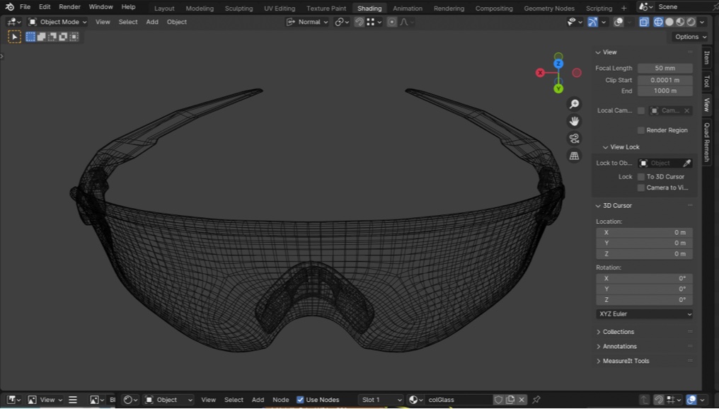
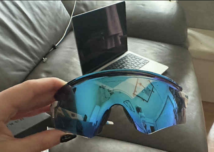
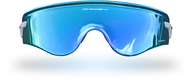
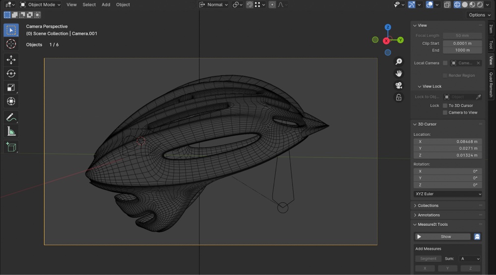
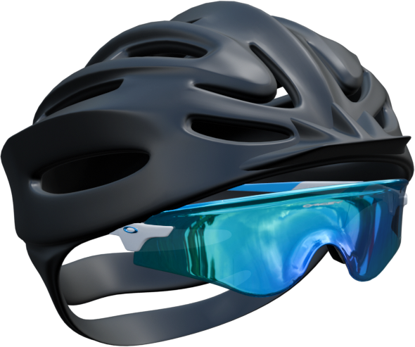
This was a tricky product to model. The glasses have no clean lines — just smooth, curved surfaces that twist and flow. The mesh was built using the actual glasses as reference, staying as true as possible to their real shape and feel.
Details to Notice
The Challenge: Designing an Immersive Web Experience
With a mix of rubber, plastic, and glass-like materials, these glasses are anything but simple. Nailing those textures was key to making the model feel true to the real thing.
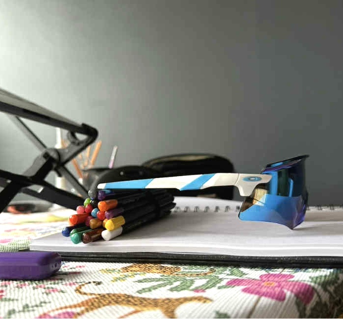
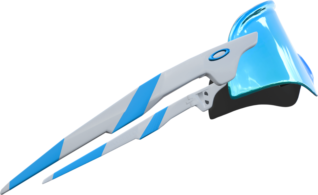
To maximize realism, all small markings were added by hand, such as logos, serial numbers, factory stamps, and even the tiny stickers you’d see on a real pair.
The lens reflects multiple colors depending on the viewing angle — just like the real thing. The reflection also shifts interactively as the glasses move to follow the user’s cursor.
The First Version
Our Creative Process in 3D Web Development
At Imagine this we hold ourselves to very high standards.We poured a lot into the first version. It looked great. It had strong visuals, thoughtful structure, and a solid foundation.
But the more we sat with it, the more something didn’t sit right. It wasn’t bad — it just wasn’t doing enough. It wasn’t truly guiding visitors toward buying. And for a product this special, "good enough" just wasn’t good enough.
But the more we sat with it, the more something didn’t sit right. It wasn’t bad — it just wasn’t doing enough. It wasn’t truly guiding visitors toward buying. And for a product this special, "good enough" just wasn’t good enough.
The finished screens
The scroll animation
The first version prototype
!!!
A decision was made
We made a tough call: we’ll start over. Not because the first round failed — but because the bar is high, and the standard is non-negotiable. If it’s not built to sell, it’s not finished.
What Needed Fixing
The Solution: Interactive, Scroll-Based Design
1.
Problem 1. It wasn’t built to sell
The design pulled people in — but didn’t take them anywhere. It skipped the emotional journey buyers need before they’re ready to say yes.
2.
Problem 2. No real momentum
The page didn’t build toward anything. It missed that sense of progression — the kind that draws people in deeper and makes the call-to-action feel like the natural next step.
3.
Problem 3. Not enough passive learning
The copy didn’t do enough heavy lifting. Visitors weren’t naturally absorbing key product benefits as they scrolled. It asked them to think too much, instead of letting the value sink in effortlessly.
Time to start over
Time to start over
The Design Process - Again
Results: Engagement & Impact
This round was about sharpening what mattered. Clean structure, sharp copy, clear goals. Every choice had one job: bring the product closer to the person viewing it.
The new explorations
The finished new screens
The new scroll animation
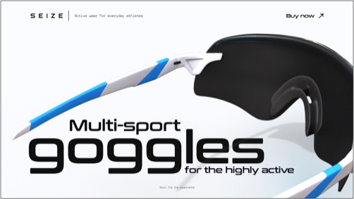
Visual Framing Prop
Sometimes the smallest additions change everything. A helmet brought in context, scale, and just enough narrative to push the scene from good to grounded. The product became easier to relate to — and easier to want.
The Color Configurator
Seeing all the options in one place, and interacting with them, gives users confidence in their choice. The color configurator is where the site moves from showcasing to selling.
The Final Result
This is where all the pieces click — clean design, clear messaging, and interactive elements working together seamlessly. Every detail supports the user’s journey, making it easy to explore, understand, and ultimately decide. This is more than a website; it’s a tool built to connect, engage, and convert.